It’s a supply demand chart, they do makes sense, but usually require a bit of explaining to really understand.
The short answer though is that population growth has outstripped housing growth since Reagan, limiting supply. While interest rates since Reagan have increased demand. Lots of reasons why, on both sides, end result is a deep hole of expensive housing, and a lot of bad ways to fix it.


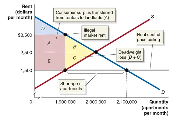
This graph makes no sense
It’s a supply demand chart, they do makes sense, but usually require a bit of explaining to really understand.
The short answer though is that population growth has outstripped housing growth since Reagan, limiting supply. While interest rates since Reagan have increased demand. Lots of reasons why, on both sides, end result is a deep hole of expensive housing, and a lot of bad ways to fix it.